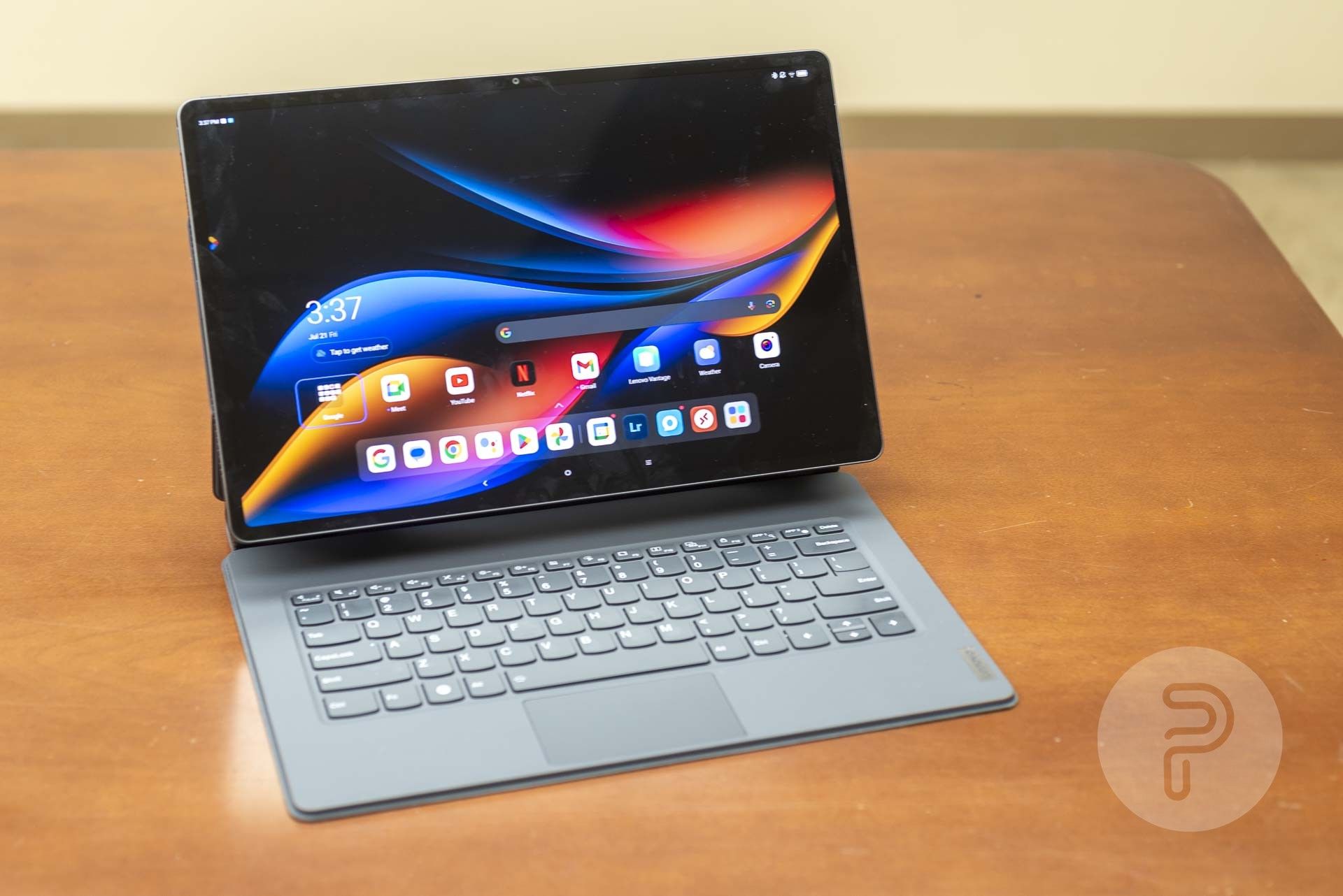
Usually, when I think of Android tablets, I think of something like the Amazon Fire HD that’s inexpensive, small, and lightweight. A good portable screen that’s a bit bigger than a phone and good to use while your phone is on a charger. The Lenovo Tab Extreme is not that at all. This is a big Android tablet with a stylus and a keyboard cover that can stand it all up like a laptop. It’s as big and heavy as many laptops, too. Can Android scale up to compete with full-powered desktop operating systems on laptop-like hardware? Let’s find out.
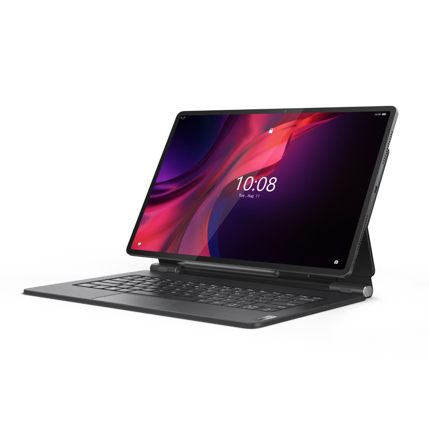
Lenovo Tab Extreme
Lenovo’s Tab Extreme is an Android tablet with a huge 14.5-inch screen and a full keyboard magnetic cover case that can hold the tablet like a laptop computer.
- Brand
- Lenovo
- Storage
- 256GB (with MicroSD support up to 1TB)
- CPU
- MediaTek Dimensity 9000
- Memory
- 12GB LPDDR5X
- Operating System
- Android 13
- Battery
- 12,300 mAh
- Ports
- 1X USB-C 3.2; 1X USB-C 2.0
- Camera (Rear, Front)
- 13MP f/2.2 front; 13MP f/2.4 rear; 5MP depth sensor
- Display (Size, Resolution)
- 14.5-inch 120Hz OLED, 3000×1876
- Price
- $950
- Colors
- Storm Grey (dark grey)
- Expandable Storage
- Yes
- Dimensions
- 12.91×8.30×0.23-0.28 inches (327.8×210.8×5.85mm); 1.6 pounds (740g)
- Large OLED screen
- 8 excellent JBL speakers
- Long battery life
- Included stylus and nice keyboard cover
- Can easily act as additional monitor for other PCs
- Android has a terrible user experience on screens this size
- As large and heavy as much more powerful laptop computers
- Small trackpad
- Android software is extremely limited compared to what could be done on a Windows, Linux, or Mac laptop of this size
What’s in the Box
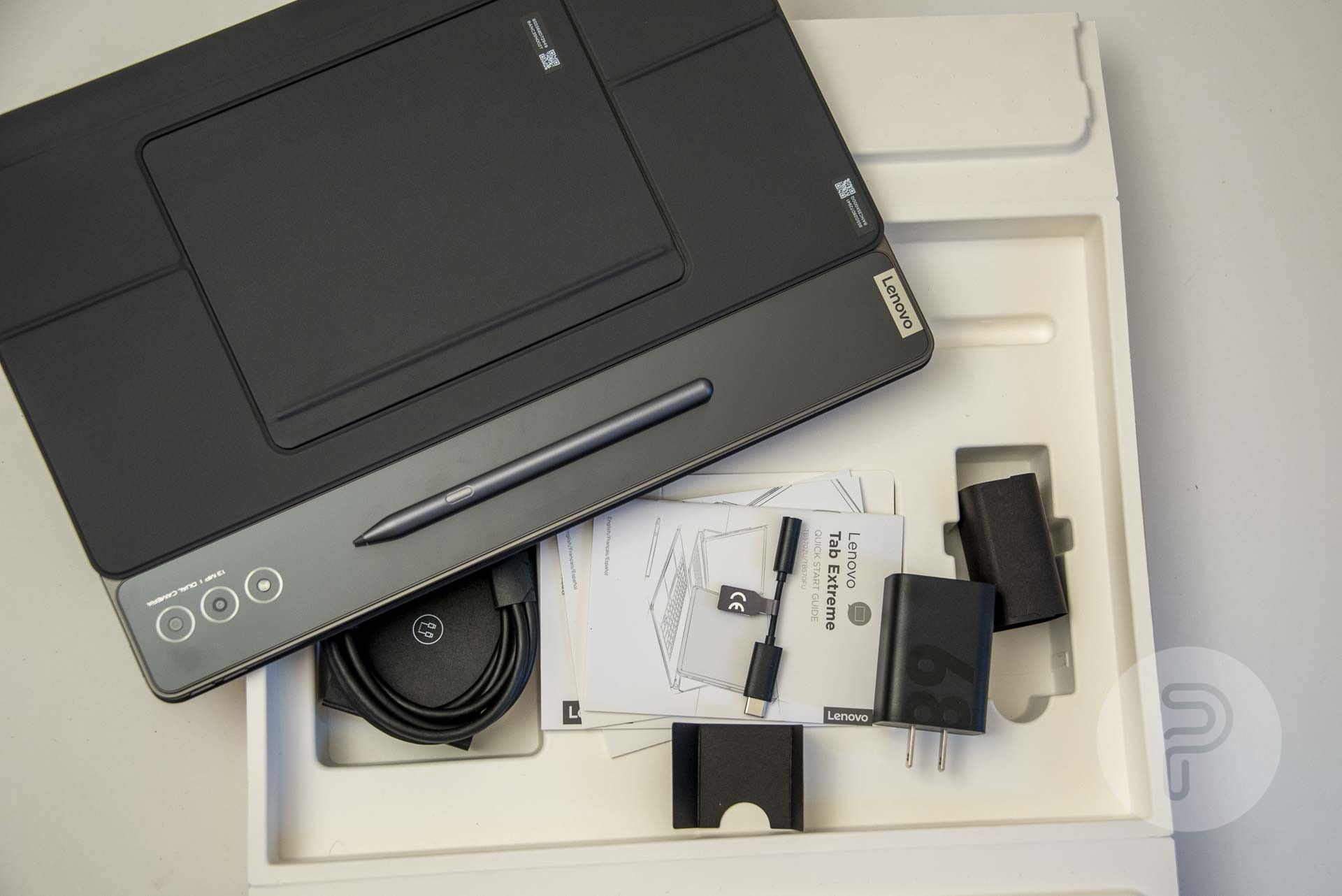
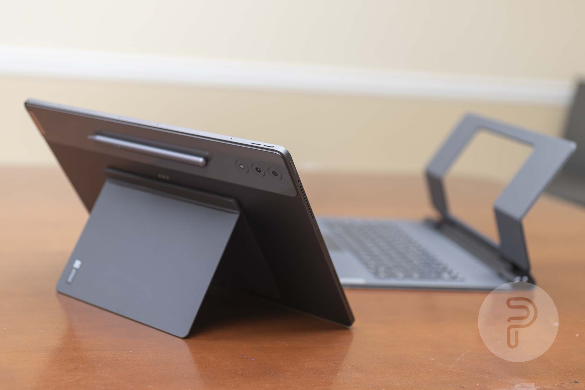
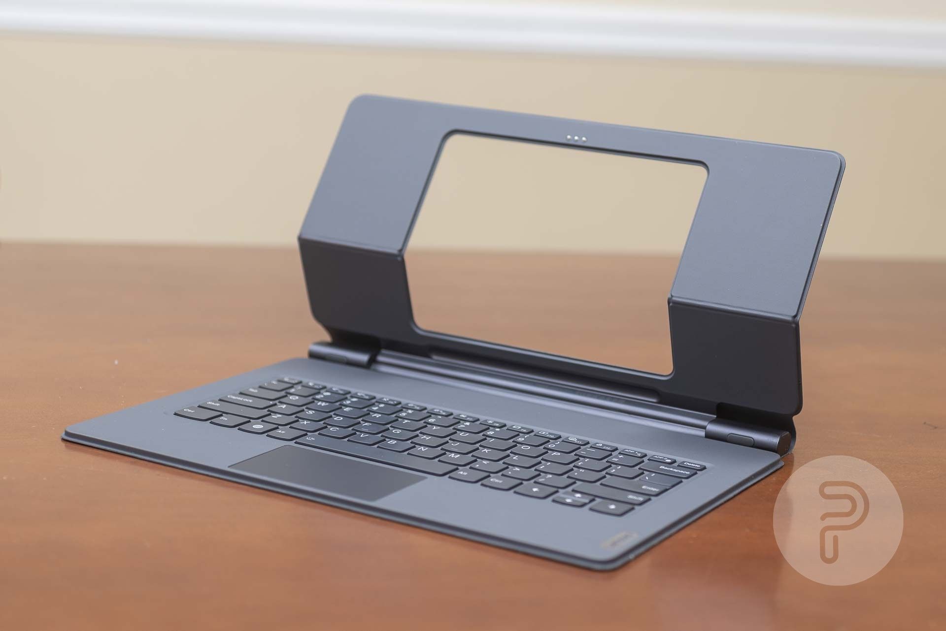
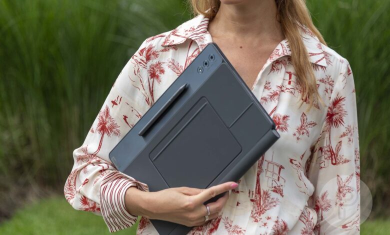
The Lenovo Tab Extreme comes with a good number of excellent accessories. First of all of course you’ve got the tablet itself. Then there’s a small magnetic kickstand that sticks to the back of the tablet. Then there’s the excellent hardware keyboard cover and stand that also magnetically attaches to the tablet. We’ve also got a rechargeable stylus that also magnetically attaches to the tablet.
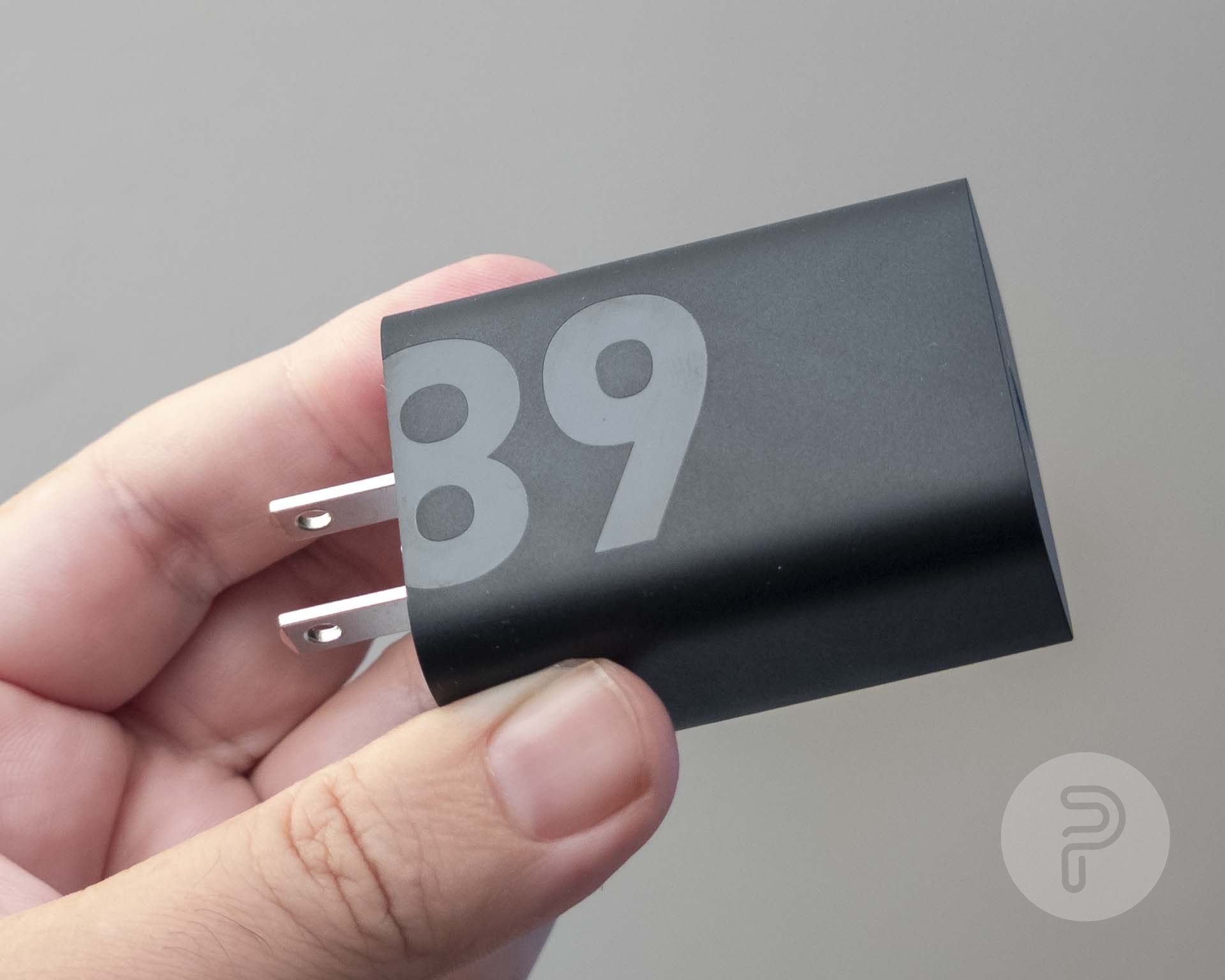
Then there’s the USB charging cable, AC adapter brick, and a USB-C to 3.5mm headphone jack adapter, along with some paper documentation. The AC adapter has the number 68 written on it since the tablet supports up to 68W quick charging.
Hardware
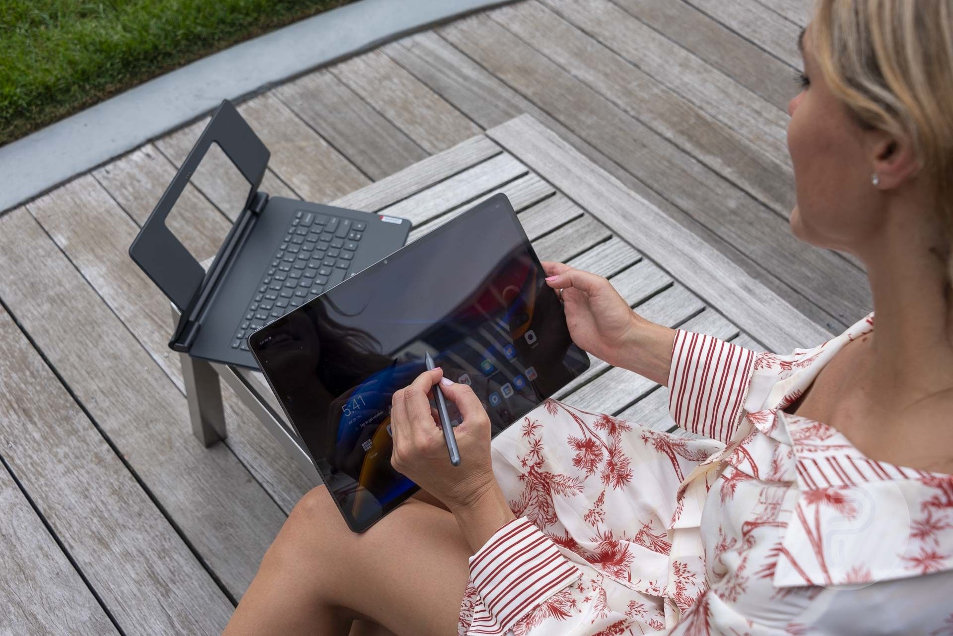
We tested the Lenovo Tab Extreme at the rooftop garden of an apartment building in the middle of Times Square.
It’s quite comfortable to hold with one hand while using the stylus with the other, but the display can be difficult to see outdoors, especially with its glossy finish. I know people love thin bezels too, but with a tablet, thin bezels make it difficult to hold. There needs to be something to grab onto on the edge.
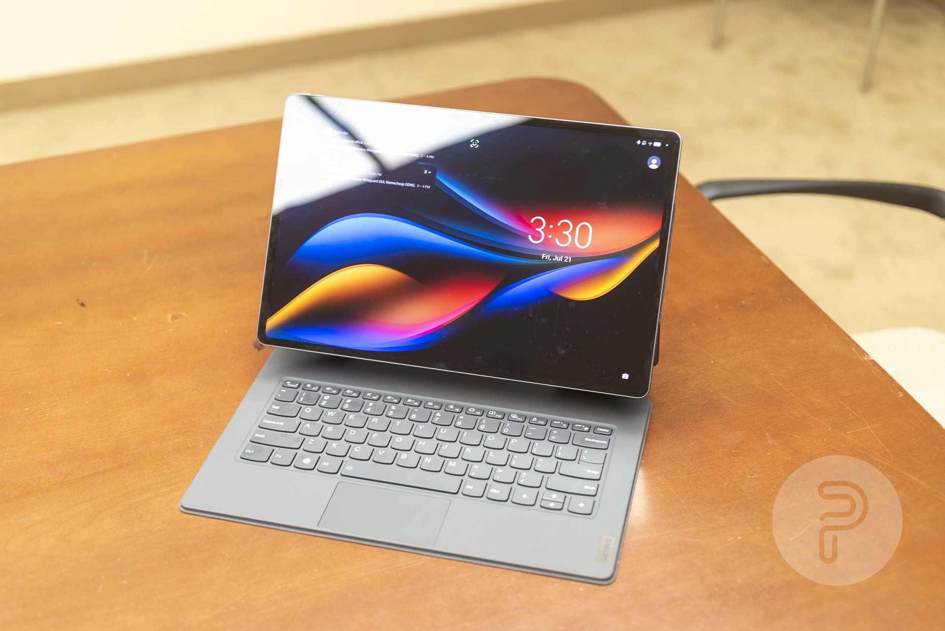
The screen looks much better indoors, but again the glossy finish causes bright reflections that can obscure parts of the display’s visibility.
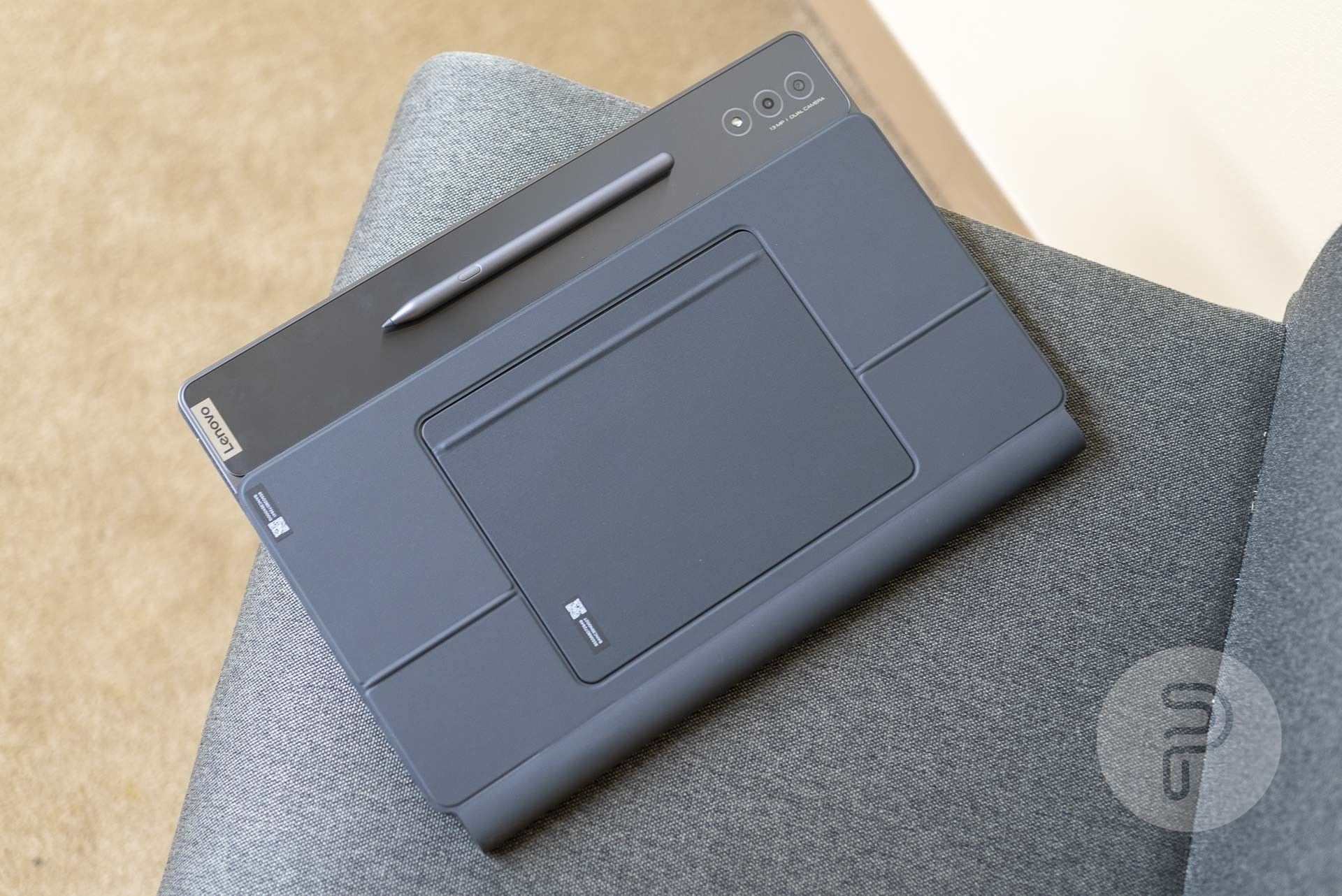
The smaller rectangular piece included in the box magnetically sticks to the back of the tablet and then you can tilt out a kickstand in order to prop the tablet up at an angle on a table or desk.
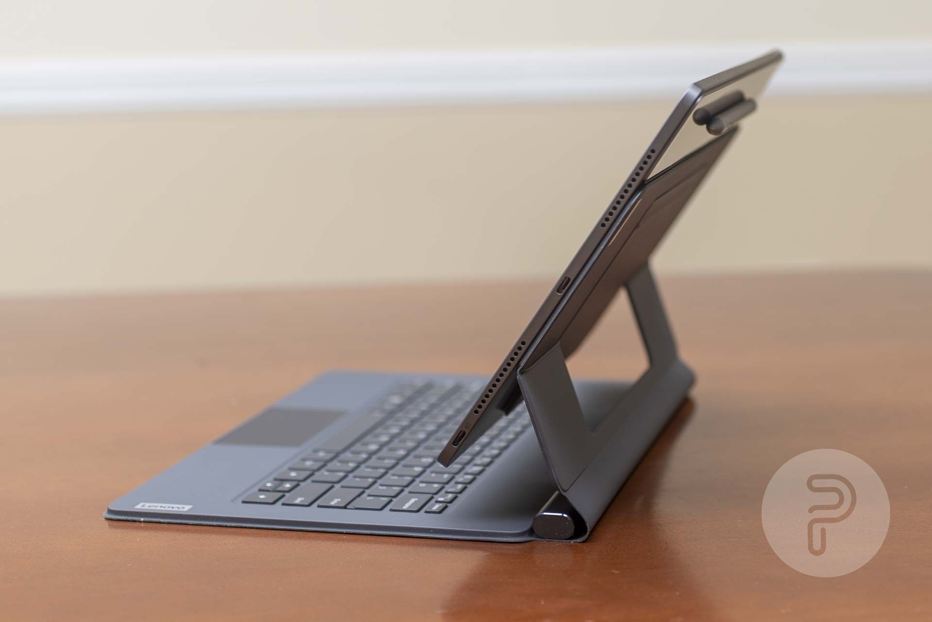
The keyboard cover has a hole for the smaller magnetic kickstand piece as well as folding hinges around the hole.
The stand is very sturdy with plenty of friction in the hinges. The lower hinge actually clicks into place as well which keeps it from moving accidentally. Then the secondary hinge tilts freely to adjust the screen angle.
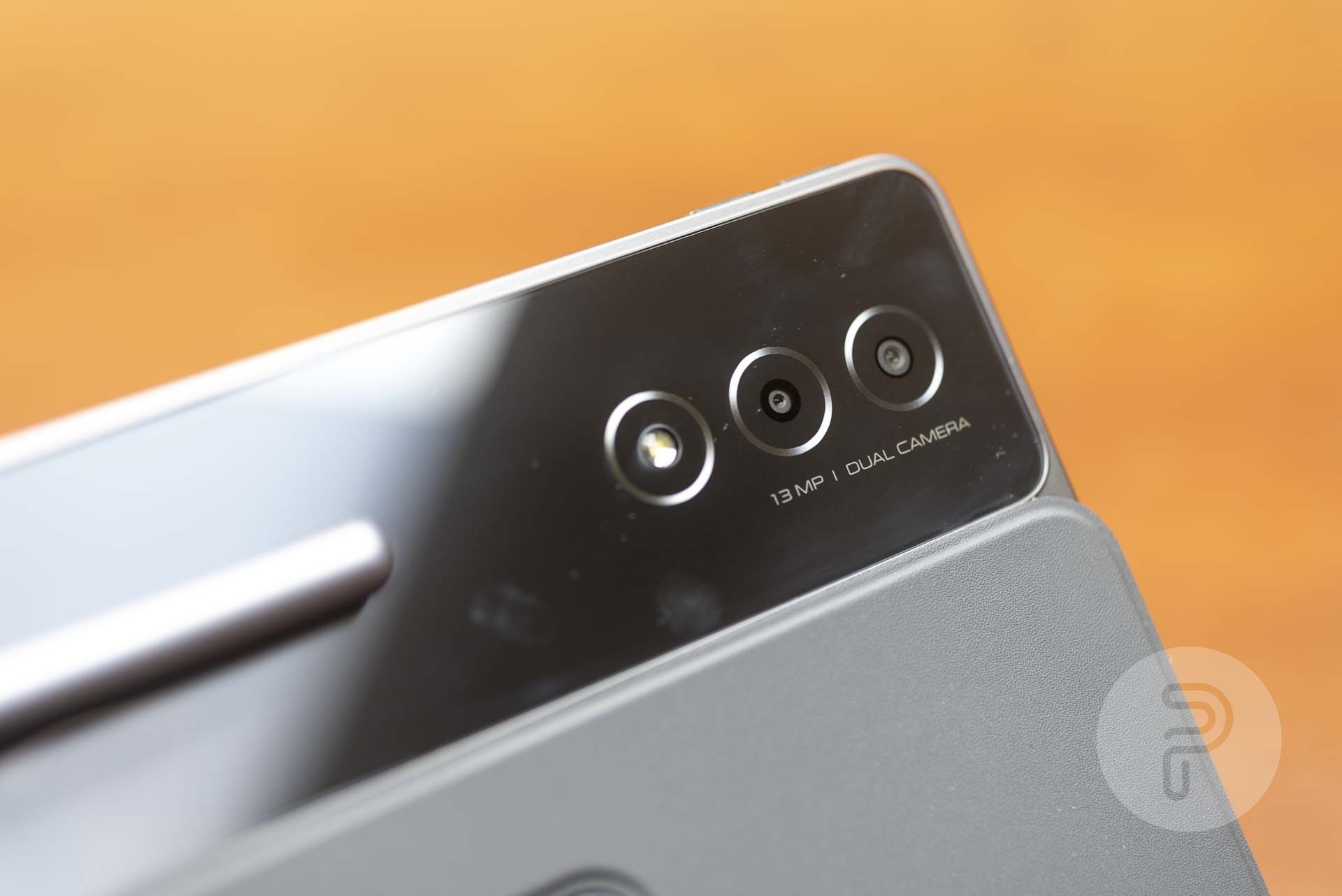
We’ve got two cameras and an LED flash on the back. The main camera is a 13Mp ultra-wide angle camera. The 2nd one is a 5Mp depth sensor. The camera software pretends that there are 3 cameras though with buttons for 1x, 0.5x, and 2x, but really those are just pre-set digital zoom levels.
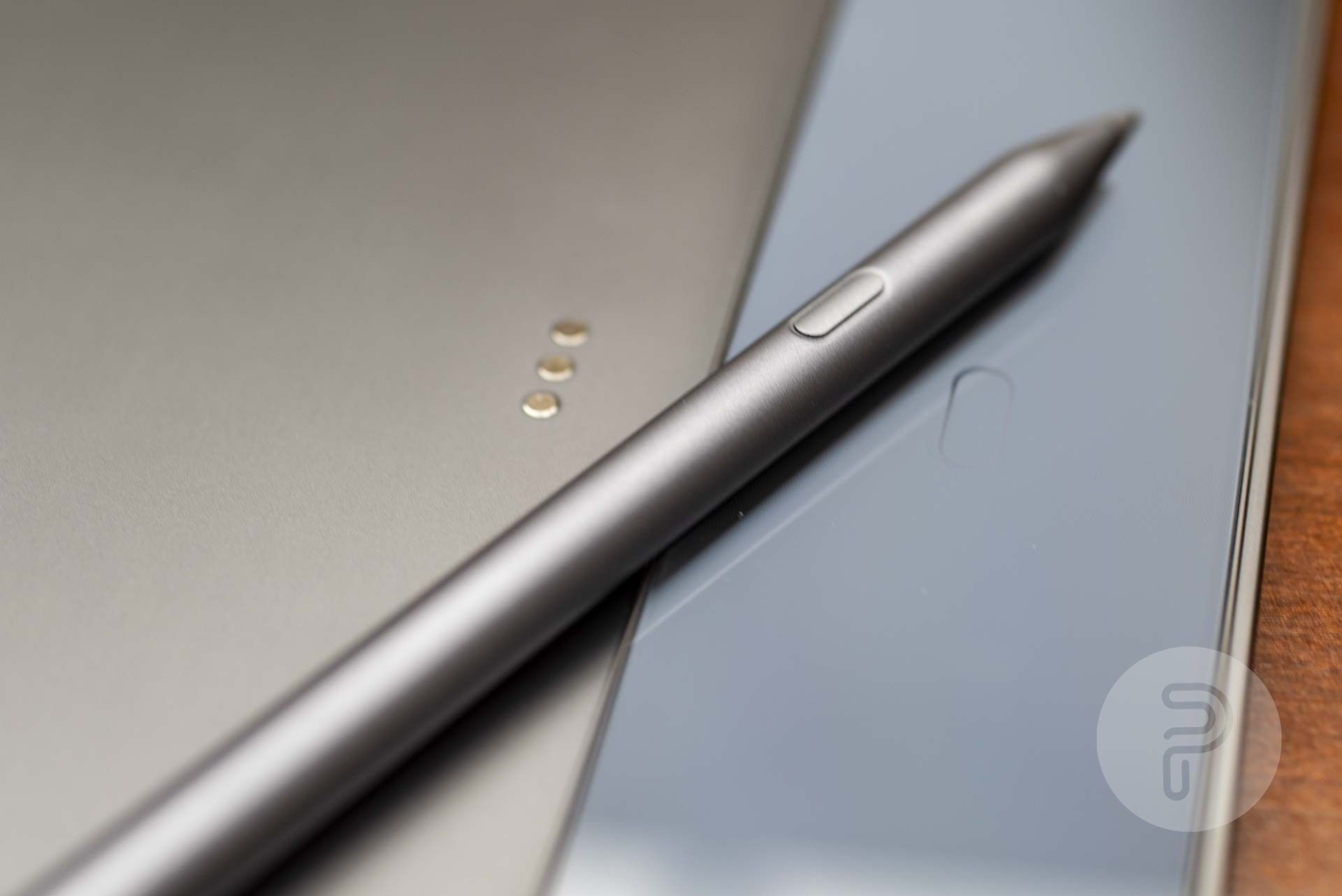
The Tab Extreme comes with the Lenovo Precision Pen 3. It magnetically attaches to the back of the tablet where it also charges itself from the tablet’s battery. It can also magnetically attach to the bottom edge of the tablet. The pen itself feels very plasticy a lot like the Apple Pencil. In Android, its user interface behaves mostly the same as a finger on a touch screen though certain drawing apps do support the pressure sensitivity input.
The tablet, keyboard cover, kickstand panel, and precision pen all fold together for a nice laptop-sized portable package. The stylus is the most likely to fall off in this configuration though, so be sure not to lose it.
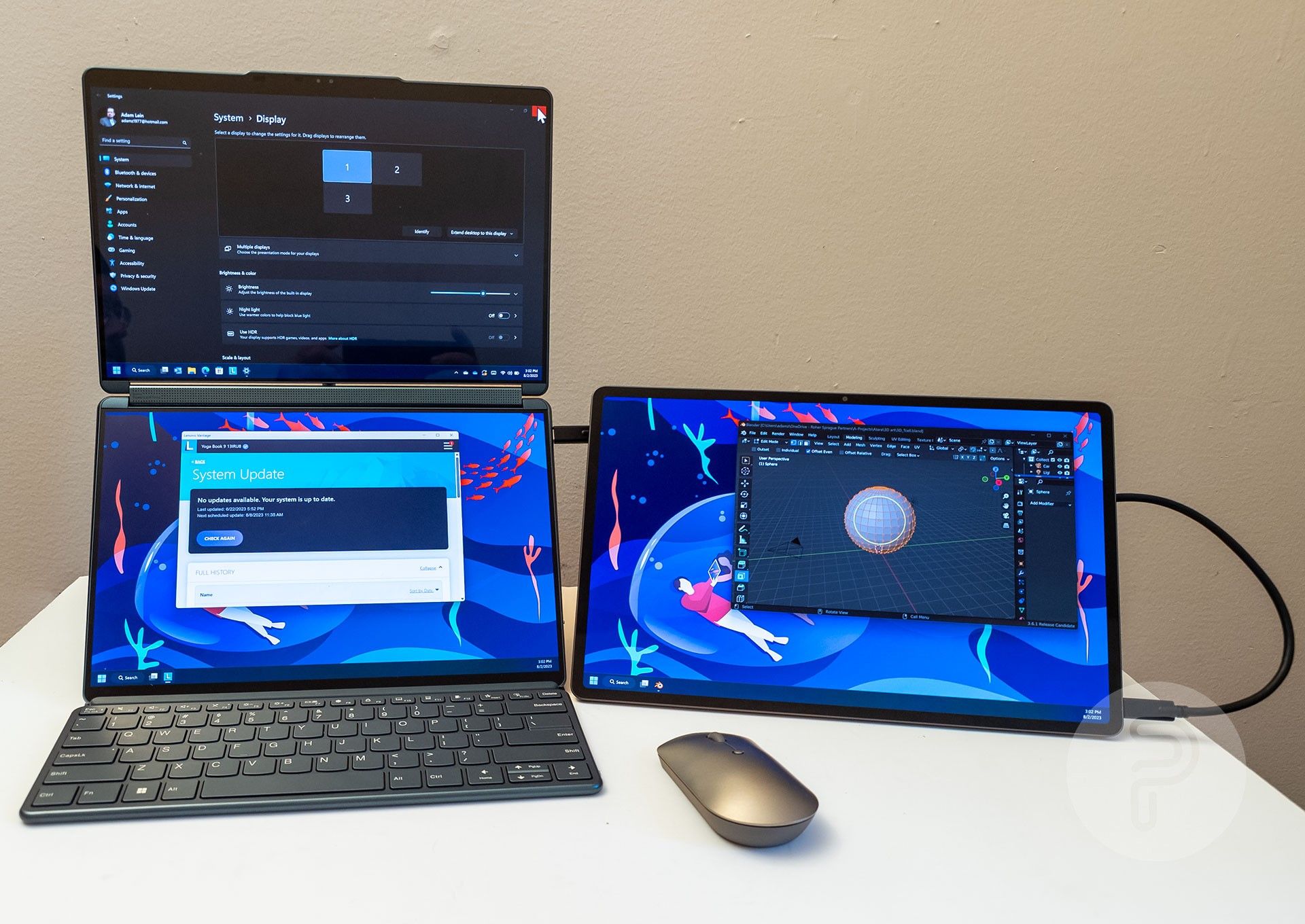
The Lenovo Tab Extreme supports Lenovo’s Freestyle wireless second screen feature. You can download the Lenovo Freestyle app on a Windows PC, and then use that to connect to the Tab Extreme as a second monitor.
Or, you can also just use the included USB-C cable to plug the tablet into a PC and use it as another monitor that way as well. You need to use the USB-C port on the bottom corner of the tablet, by the way, not the centered USB-C port. This is an excellent plug-and-play method of getting an extra screen on any PC with USB-C display port capabilities.
Software
The Lenovo Tab Extreme runs Android 13 and thusly all of the Android apps in the Google Play store. There are some customizations from Lenovo as well, which constitute Lenovo’s “ZUI” and attempt to make the Android user experience on such a large-screen tablet a bit better… but it still has a lot of user interaction problems and takes some getting used to.
The home screen is pretty familiar with a row of icons at the bottom that copies Mac OS X from 23 years ago. This user interface convention has always struck me the wrong way since the icons are not easy to understand because they don’t have labels telling users what they do. On Mac OS X, you had to move the mouse over each one to learn what they do before clicking, but Android doesn’t have tooltips for unlabeled icons, so it’s even more frustrating as a new user will have zero interfaces for translating the mystery meat icons without activating them. Every usability test ever conducted on the subject has proven this design to be problematic and reduce engagement. (1)
It’s also important to note that you have two system navigation options to choose from… The default “gesture navigation” puts a little white line at the bottom of the screen at all times. You must then learn the touch and swipe gestures associated with this wiener-bar in order to navigate to the home screen, switch between apps, go back within an app, etc. It’s 100% not intuitive unless you’ve already learned these gestures from other devices. What’s worse is that gesture navigation requires more work both physically and in terms of cognitive energy. You have to memorize how to use it since there are no visual cues about its function, and you have to move your fingers much larger distances in order to complete the commands. The “back” gesture of swiping the left edge of the screen also interferes with apps that use that same gesture for a different function.
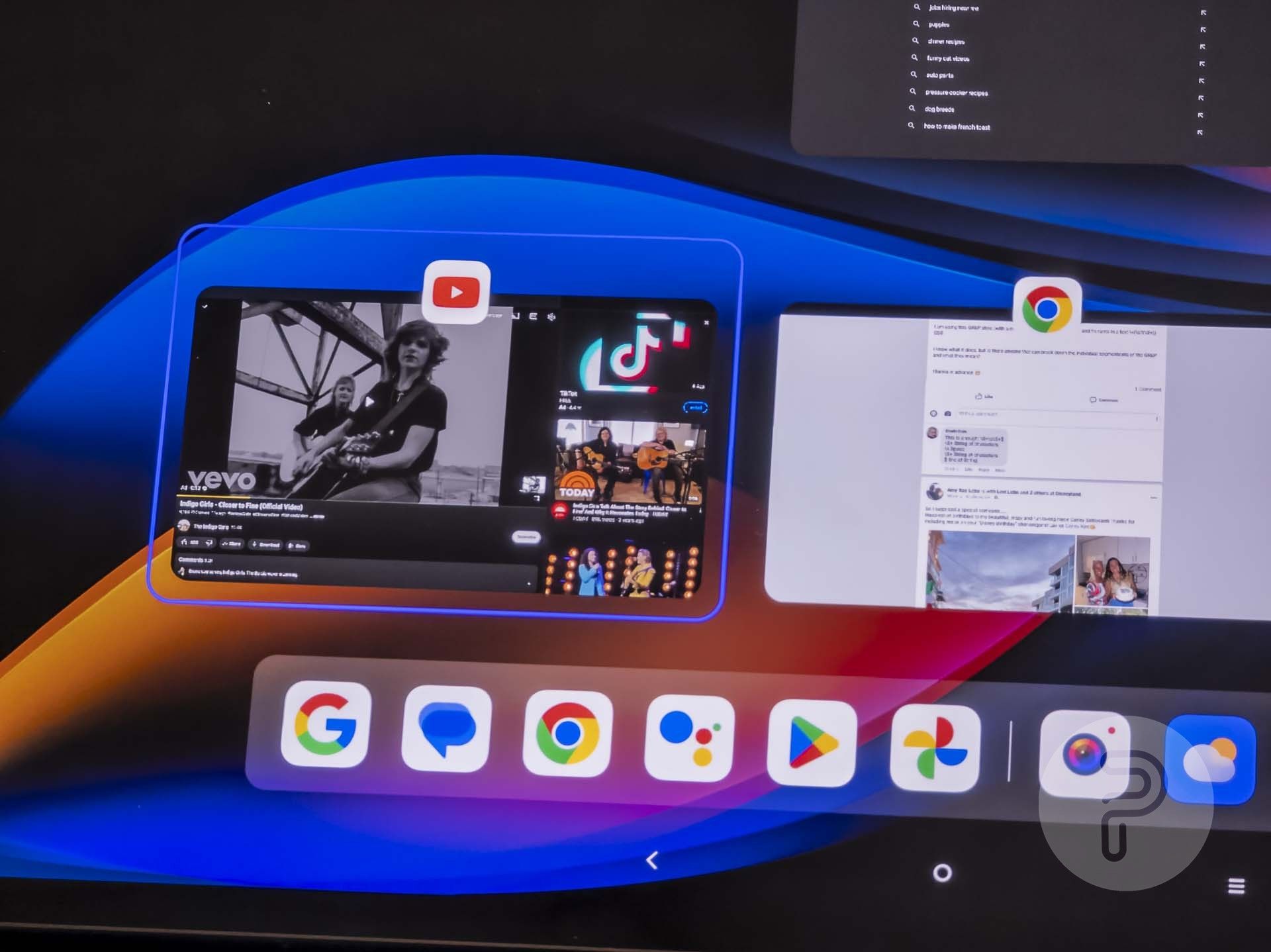
I prefer the “Virtual key navigation” option, which uses the triangle, circle, and hamburger shapes as back, home, and task switcher buttons. These are also unintelligible and unintuitive unless you’ve been using them on Android for a decade already, but they have the advantage of only needing to be pressed once in order to activate. There is less physical exertion required compared to gesture navigation. This navigation mode also puts a permanent Mac OS X style taskbar at the bottom of the screen no matter which application you’re using and thus gives you one-click access to switching between the 4 most recently used applications along with whatever application icons are pinned to the left side. A bunch of Google apps are pinned to the left side by default, but you can drag/drop icons there to customize it how you see fit. The triangle, circle, and hamburger buttons are also ever-present here for easy one-click access as well, though they are located in the lower right edge, which is where I would normally expect the system tray and clock icons to be.
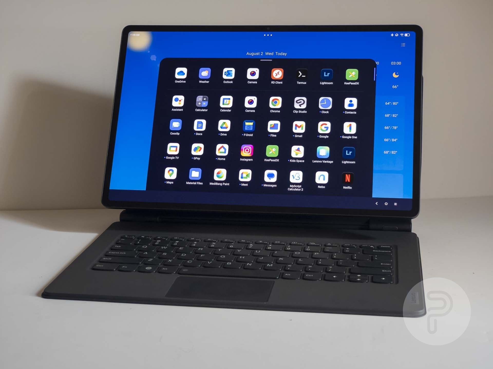
The multi-color waffle icon in the dock will open a larger pop-up list of other applications kind of like a start menu would on Windows, but this list is not searchable with the keyboard if you activate it when you’re not on the home screen. I’m very used to hitting the start button on a keyboard and typing the first part of the name of the app I want to launch, then hitting “enter” to launch it. Android’s method is much more work.
Furthermore, it doesn’t even work with the Tab Extreme’s trackpad left click function. That’s right, left-clicking in that app drawer doesn’t work. I have to reach up and poke with a finger instead. Left-clicking does work on the regular home screen and other taskbar buttons though… and, get this, the application drawer that’s launched on the home screen from that same multi-color waffle icon in the taskbar is DIFFERENT from the one you activate from the same taskbar when not on the home screen. The home screen version does respond to the left click of the keyboard trackpad and also has a search field at the top.
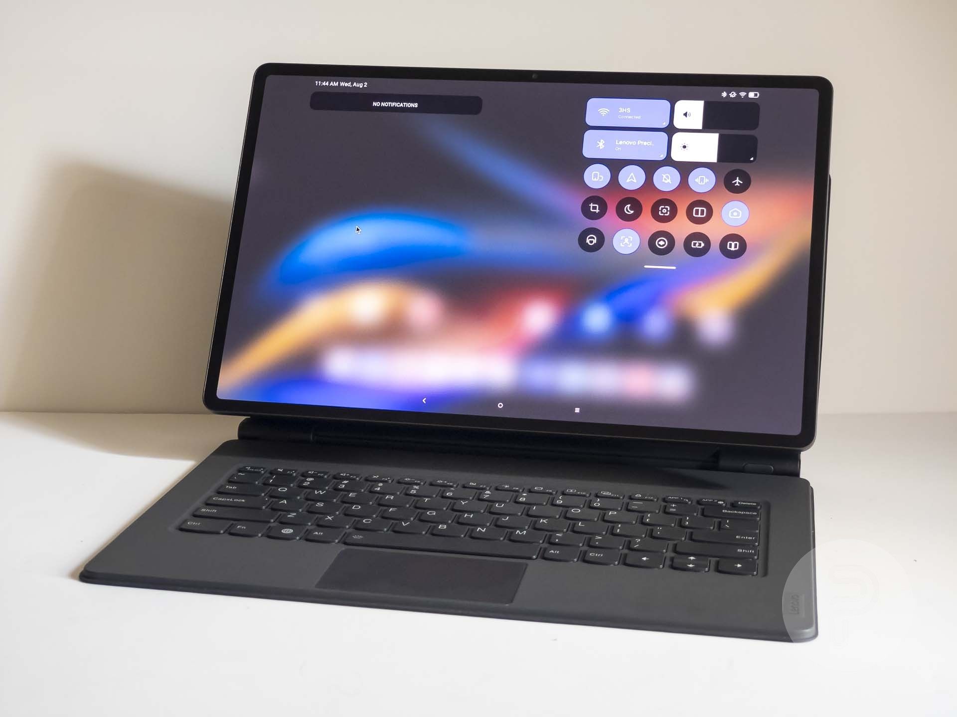
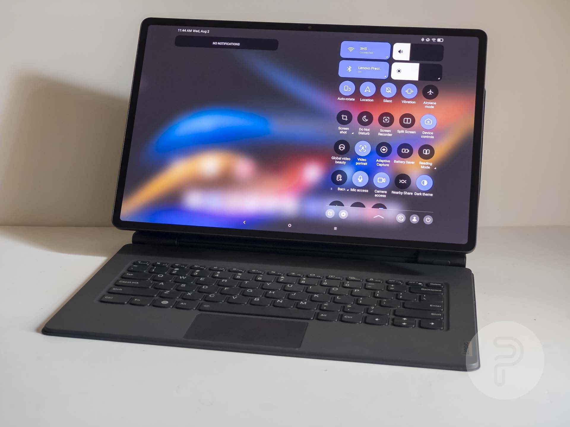
Android’s notification and control panel shade on this sized screen is also pretty frustrating. The first swipe shows some system controls in a very compressed area that only takes up about 25% of the screen.
You have to swipe down AGAIN in order to see all of those controls (including the settings button) as well as to show the labels of what each unintelligible icon actually means. If it loaded like this after the first swipe, you would save a lot of cognitive energy in being able to see and read everything all at once and you’d save on muscle energy by not having to use double the physical movement.
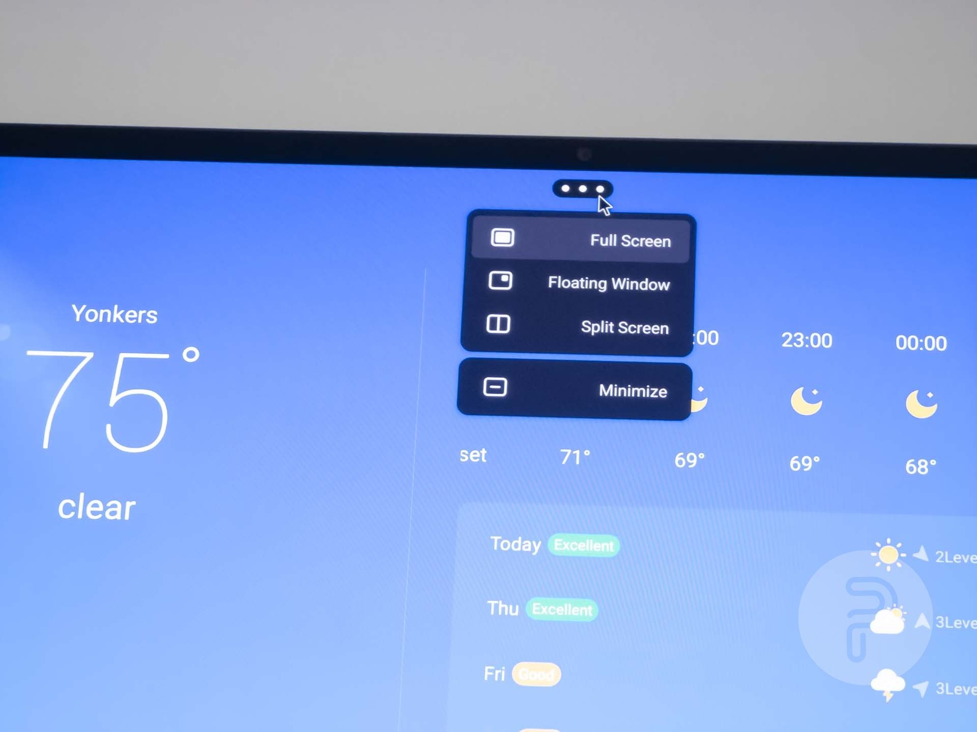
At the top of each app is three dots side by side. It looks like one of those paging indicators that is meant to show there are two more pages if you scroll to the side, but it’s not. Really it’s a window management menu that allows you to snap an app into one half of the screen or make it a phone-sized floating window. The “bad design” aspect here is that window management controls take two clicks as opposed to the one-click that normal Windows, Mac OS, and most Linux desktop environments have settled on decades ago.
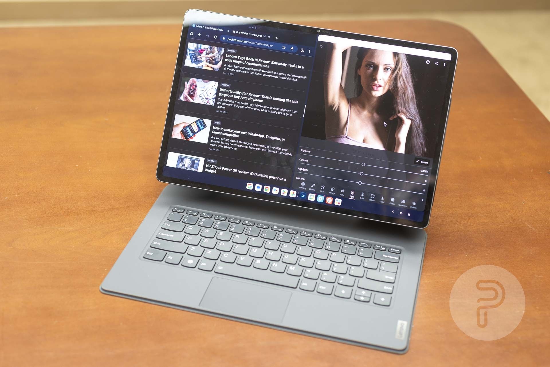
Split screen works pretty nicely in landscape mode as many Android apps are not very well-designed to take full advantage of a wide screen like this, so putting two side by side is better for usability and readability. The border in the middle nicely lets you change the width of both application windows.
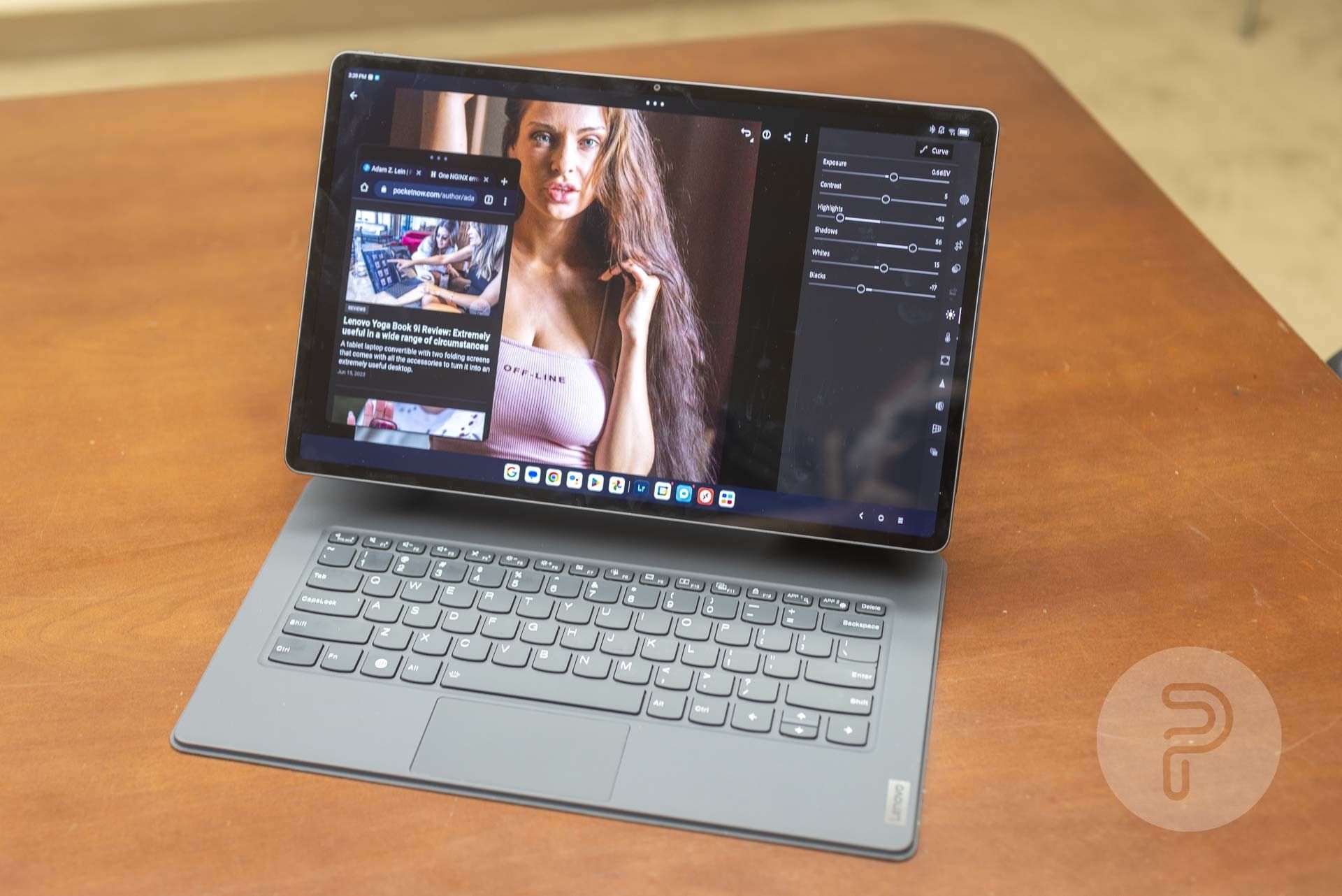
Floating windows are always on top of the full-screen windows, which can be annoying as this is not how normal application windows work on Windows, Linux, Chrome OS, or Mac OS. Tapping and holding lets you resize the windows, and you can tap and drag on the “three meatball” bar at the top to move the windows around. Spreading three fingers on the touch screen will nicely remove all floating windows at once to show whatever maximized application is behind them. Really I should just be able to click the application I want to use on the screen in order to bring it to the foreground, though.
Only certain apps can be enabled as floating windows, though, and it’s a pretty small number. Many of the built-in apps can’t be used as floating windows either (such as YouTube). Some apps like Instagram don’t even load in the landscape full-screen layout. Instagram loads only in portrait mode.
Window management has even more problems. The task view shows all of the open windows at once when you press the hamburger button in the taskbar. That’s great for switching between them, but there’s no close button anywhere to be seen. Right-clicking (or 2 finger-clicking) with the trackpad doesn’t give you a window management menu or anything with a close button either. You have to somehow figure out that clicking, holding, and dragging up will close the app. It’s a very difficult gesture to accomplish with a trackpad, but with the touch screen, it’s much easier. This screen also works with the Alt + Tab keyboard shortcut, but Alt + Shift +Tab does not work as one would expect.
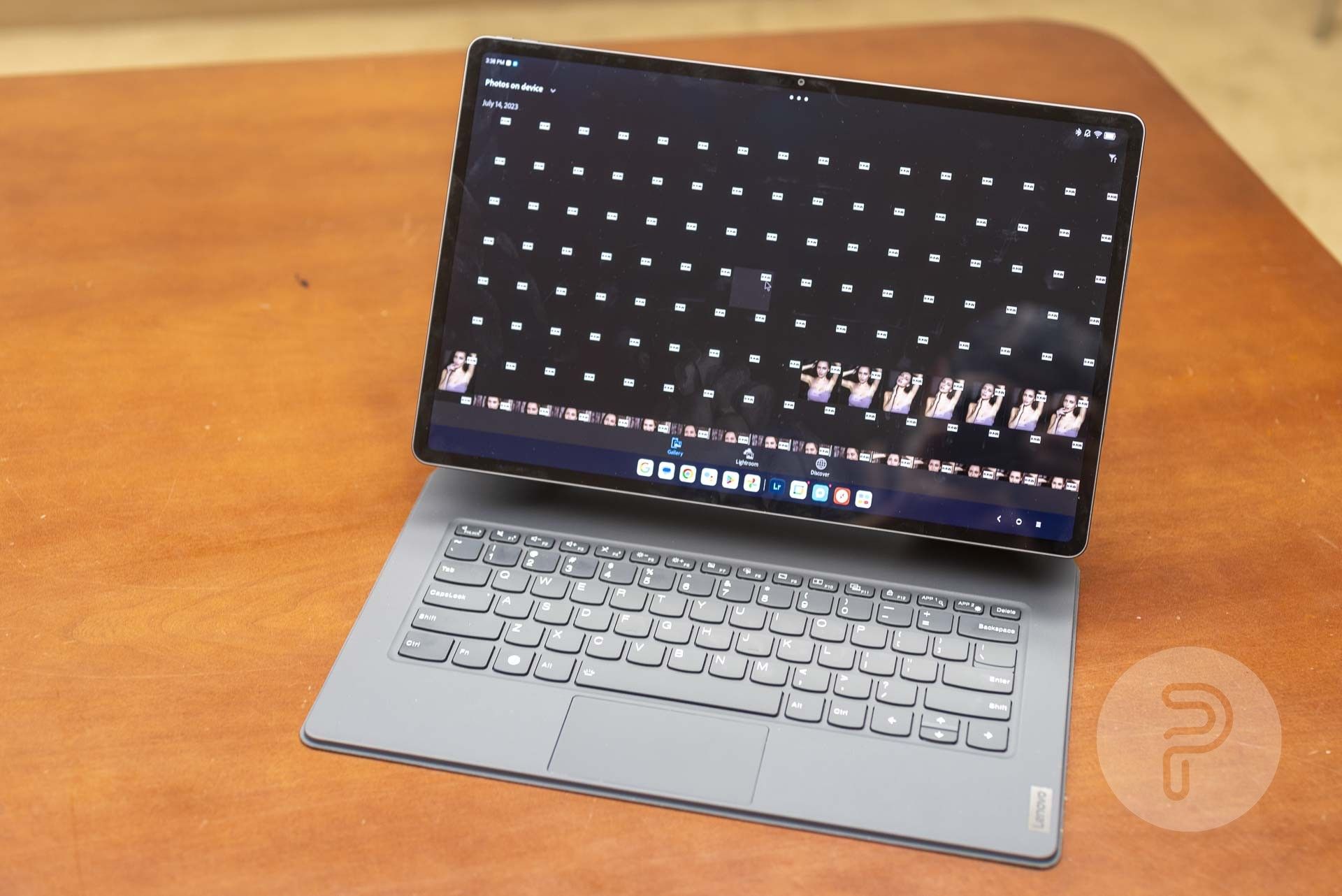
Getting actual work done on an Android tablet can be quite difficult as well, depending on what kind of work you need to do and what kind of applications you’re used to dealing with. The Android version of Adobe Lightroom is an absolute chore to use. It can barely generate thumbnails of a couple thousand of my RAW photos properly.
Normally for me, the best way to get work done on an Android device is to connect to one of my office VPNs and use a Remote Desktop app to control a Windows workstation or Linux server located on my private networks, but this is also painful on this Android tablet because the taskbar at the bottom sometimes covers an important part of the Remote Desktop app window and click+dragging with the trackpad doesn’t work properly.
Maybe if most of your work takes place within a web browser, it would be ok, but the Android version of Chrome is still pretty limited as well. There’s no visual indication of which tab is active and there are no developer tools available in the browser.
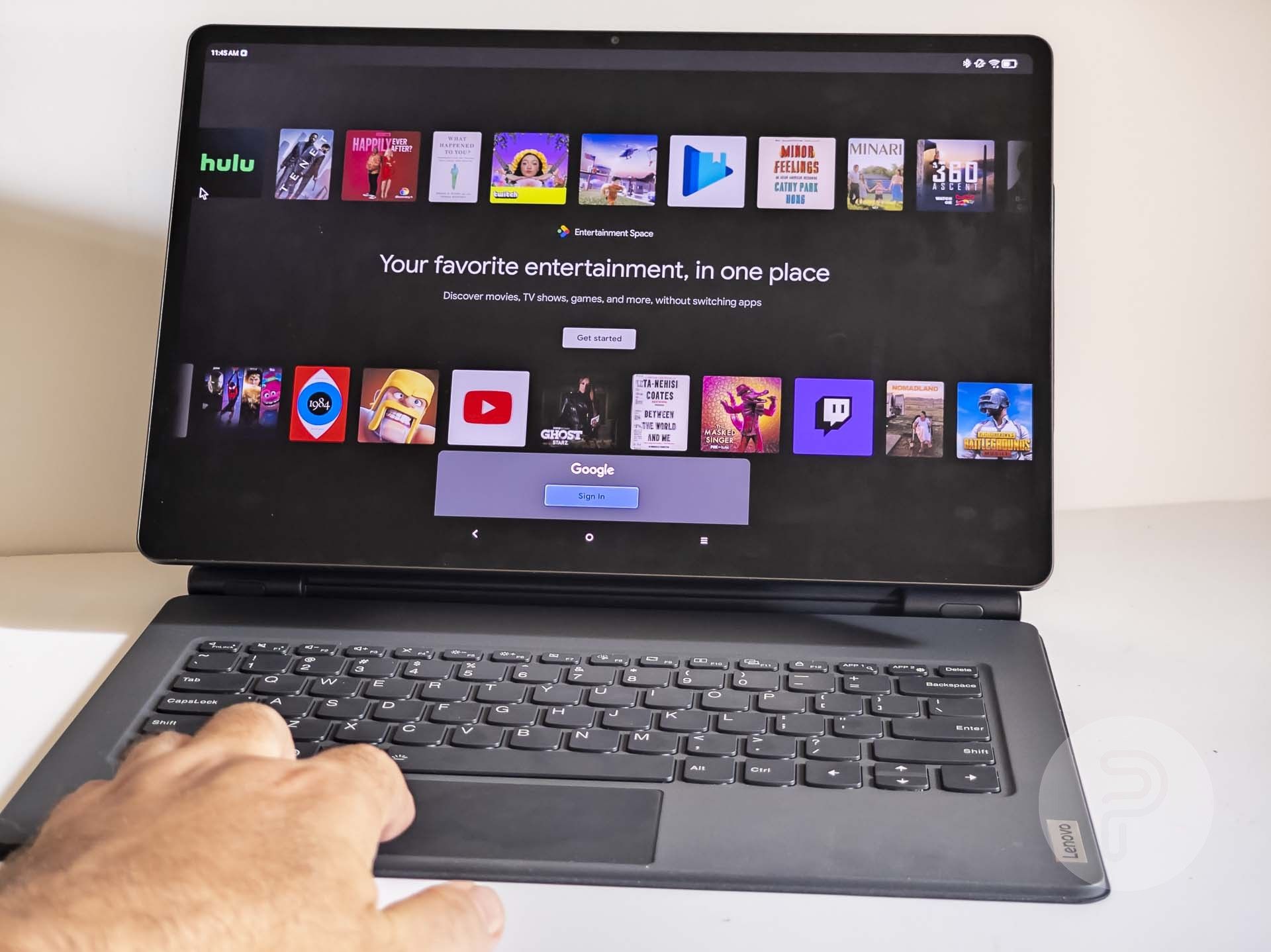
Swiping the home screen to the right reveals an “Entertainment Space” which gives you a clue as to what this tablet is really a better fit for. That’s right, watching movies… and for this usage scenario, the Lenovo Tab Extreme is excellent.
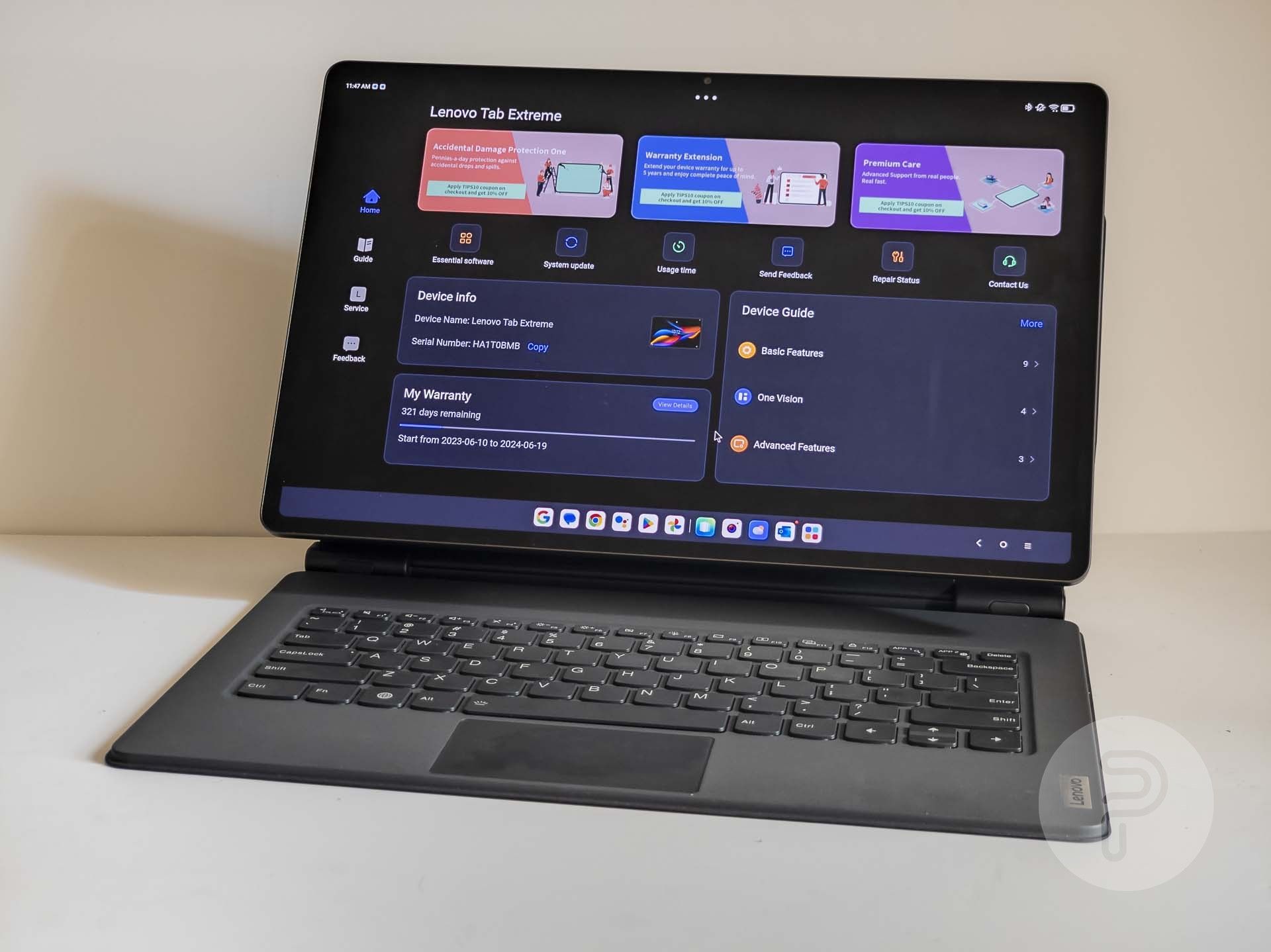
There’s also a nice Lenovo Vantage app pre-installed that gives you some special controls, tutorials, and support options.
Battery Life
We’ve got a large 12,300 mAh battery in the Lenovo Tab Extreme, which provides a good amount of battery life. I don’t feel the need to shut down the tablet completely in order to save battery as I do with Windows, Linux, and Mac OS laptops since Android is very power efficient in sleep mode. You should get about 12 hours of continuous use and the 68 Watt charger can bring it back to 100% battery in about 2 hours.
Conclusion
In my opinion, I think Android tablet PC laptop convertibles like this are not ready for prime-time. The $950 price is awfully high for such a reduction in software capabilities. I would say the same about a Chrome OS device with such a high price. Now, if the Lenovo Tab Extreme was running Microsoft Windows instead… this would be a totally different story. Microsoft Windows has had superior stylus and tablet interface features since 2002, not to mention a much more robust ecosystem of professional-grade applications that would be very useful on a tablet of this size.
The hardware and hardware design from Lenovo is excellent. The tablet, keyboard, stylus, and kickstand are beautifully well-built and from that perspective, this is an impressive device. Unfortunately, the Android operating system and poorly-designed interface greatly degrade the experience.
Photo appearances: Liga Freimane, Signe Dulle, Kseniia Teniaeva.
Source link

