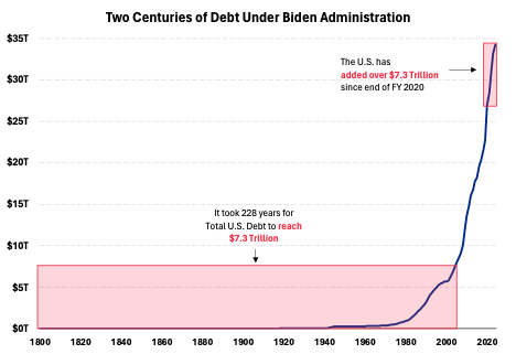
Senatorial candidate Hovde presents this picture.
Source: Hovde.
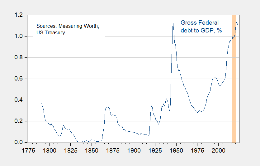
I’ll trust that the candidate’s staff did the adding correctly, although I think the calculation is pretty meaningless. For instance, how does individual colony debt in 1776 get counted? More substantively, does it make sense to report nominal debt over such a long period?* I think maybe nominal debt divided by nominal GDP makes more sense.
Figure 1: Gross Federal debt, as a percentage of GDP (blue). Note end-FY gross debt as a percentage of calendar year GDP. Orange shading denotes mostly Trump administration (FY2016-FY2020 debt). Source: US Treasury, MeasuringWorth, and author’s calculations.
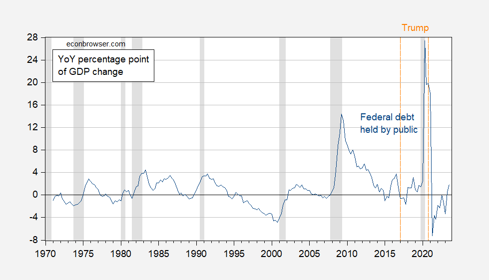
It’s a little hard to see what the recent context is with annual data (and in recent times, Federal debt held by the public, FRED series FYGFDPUN, makes more sense as a debt measure). Hence, I show the year-on-year percentage point changes in Federal debt held by public to GDP in Figure 2.
Figure 2: Year-on-Year percentage point change in Federal debt held by public to GDP ratio (blue). NBER defined peak-to-trough recession dates shaded gray. Orange dashed lines at beginning ond end of Trump administration, dated 2017Q1, 2020Q4. Source: US Treasury via FRED, BEA, NBER, and author’s calculations.
The largest percentage point of GDP increase in Federal debt takes place under Mr. Trump’s administration.
For an equally mendacious (and arithmetically incorrect) calculation, see discussion in this post.
* CPI increased by 3501% since 1776 to 2023; nominal GDP is 141750 times what it was in 1790 (data from MeasuringWorth).
Source link

