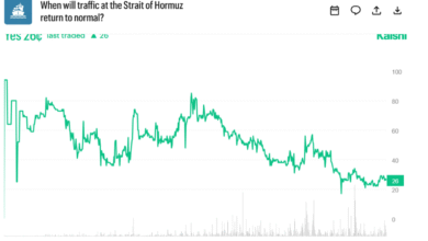

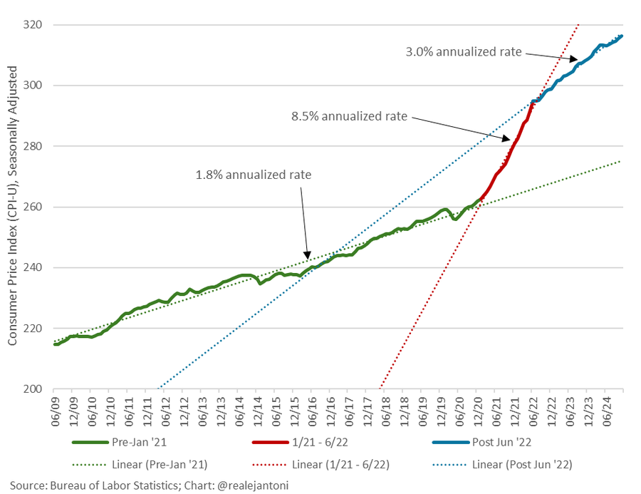
Heritage Foundation’s EJ Antoni shared this graph of the CPI level:
Aside from including the pandemic era price level, I thought about what happened to real wages. These have risen faster post 2022M07.
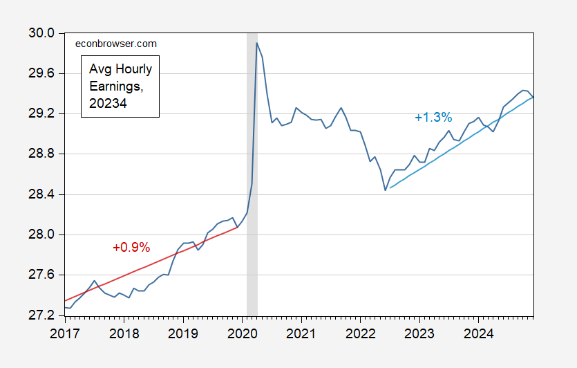
Figure 1: CPI deflated average hourly earnings (black), and 2017M01-2019M12 trend (red), and 2022M07-2024M12 trend (light blue), in 2023$. Stochastic trends estimated on logged values. NBER defined peak-to-trough recession dates shaded gray. Source: BLS via FRED, NBER, and author’s calculations.
Source link