
A reader comments on my remarks regarding 70 degrees in Madison, yesterday:
It’s these type of sensationalist posts that don’t help educate or support/facilitate the discussion regarding climate change. It only muddies the discussion as a single day’s weather means close to nothing as it relates to climate change. A denier can easily reference the historical data which is clear that a 70 degree day doesn’t come close to even cracking the top-20 warmest March days in Madison Wisconsin’s history.
OK, the 70 degrees matches the highest temperature on MARCH 3rd (in 1983). If the reader had noted the upward trend in the highs and lows in Madison, he/she would’ve understood that 70 degrees might not have been as remarkable. In fact, in the graph in the post he/she was commenting on (reproduced below for completeness), one could see that by MARCH 31st, the 90th percentile temperature was only 5 degrees below 70 degrees recorded. Hence, I can only conclude the reader is blind, or deliberately obtuse, or disingenuous to comment on MARCH (entire month) records. (Why the heck do we provide percentile bands when purportedly statistically informed people ignore them?)
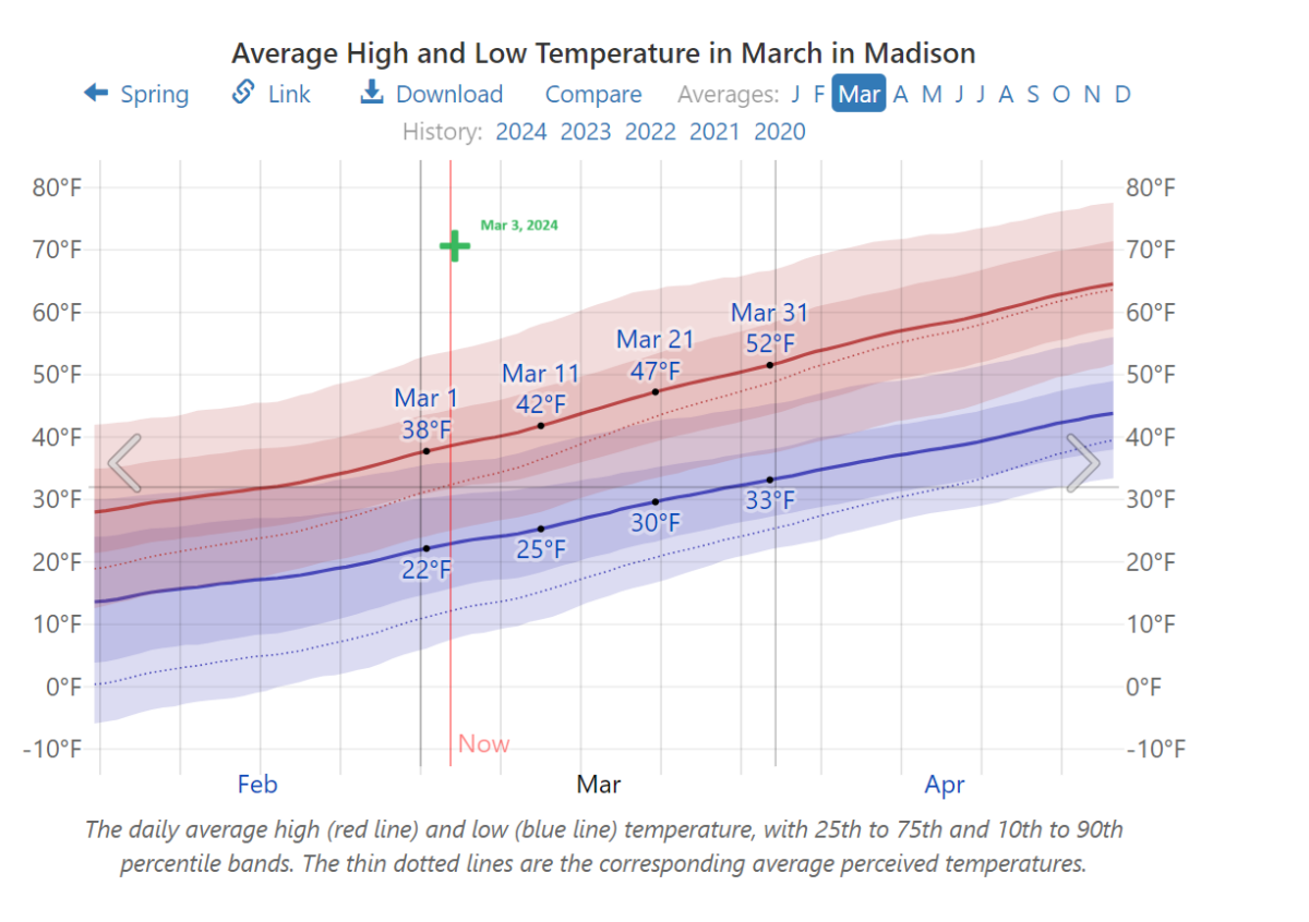
Notes: Green + indicates 3/3/2024 forecasted high for Madison, WI. Source: Weatherspark.com, accessed 3/3/2024.
How about the significance of a trend in temperatures. Here’s a map:
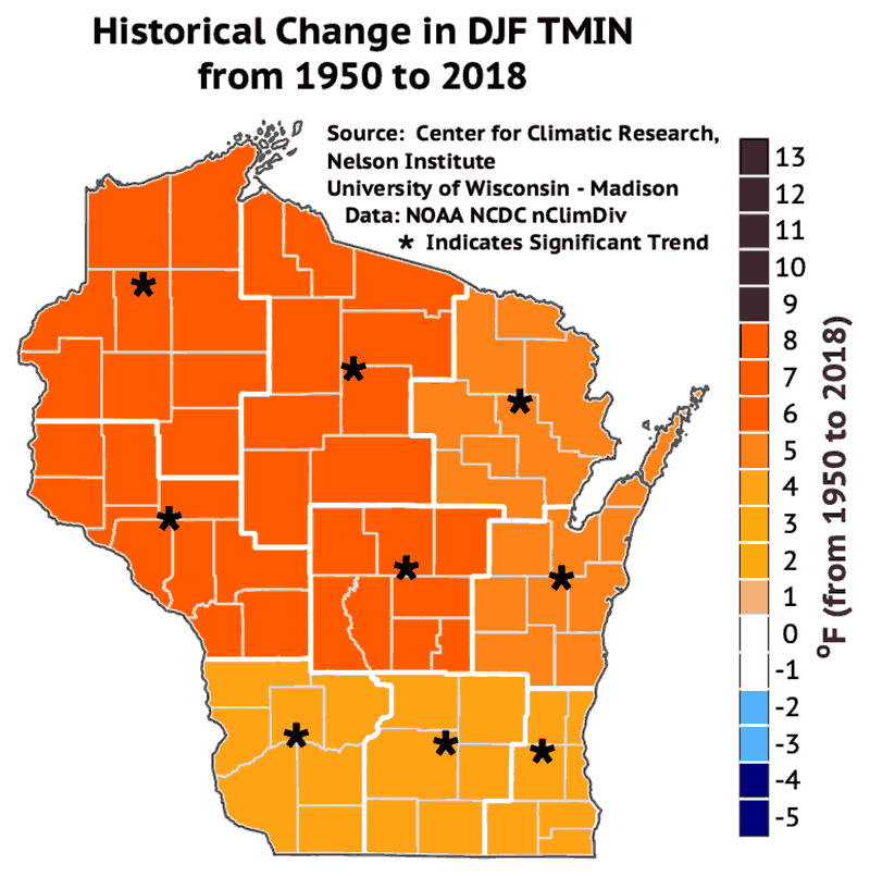
Source: Wisconsin Initiative on Climate Change Impacts.
Here’s another picture using data on Wisconsin:
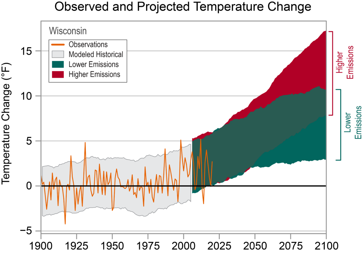
Source: NOAA NCICS.
More broadly, across the country, from the first post on Saturday.
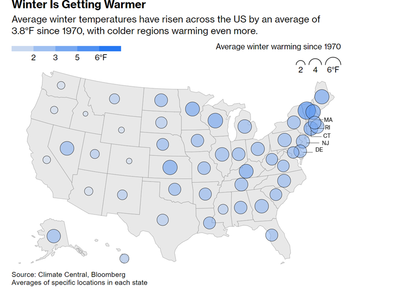
Source: Gongloff, “3 Seasons in 24 Hours Stump Climate Change Deniers,” Bloomberg.
While the second map has no indicators for statistical significance, the first one does.
Since the March 3 observation (in the first figure) lies above the 90th percentile, I might be allowed to think that this was a somewhat unusual (I suppose using the word in a colloquial manner) event. However, I’m sure the commenting reader will find some reason to disagree.
More generally, here is the global (land/ocean) temperature anomaly as tabulated by the NOAA:
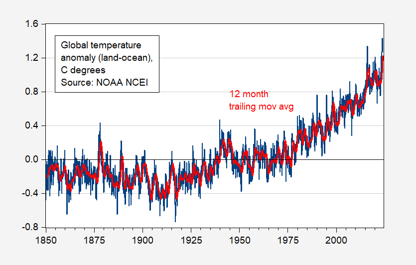
Figure 1: Land-Ocean global temperature anomaly, by month (blue), and 12 month trailing moving average (red). Source: NOAA, and author’s calculations.
Source link