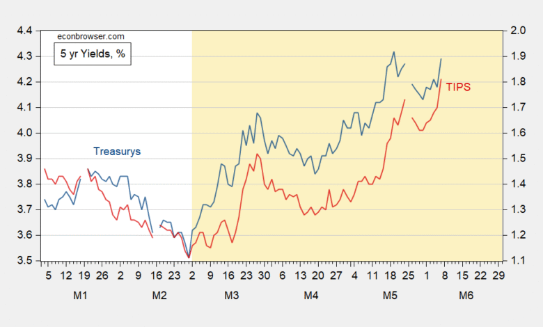
Big jumps in yields; as shown at the five year maturity, the move is evident in both nominal and real yields:
Figure 1: Treasury 5 year yield (blue, left scale), TIPS 5 year yield (red, right scale), both in %. Source: Treasury via FRED.
What is notable is that this is not a recent peak in the nominal yield, but it is in the real yield. This suggests not upward revision primarily in inflation expectations, but rather in real yields (higher economic activity leads to greater demand for credit). It could be that term premia in real and nominal rates could be obscuring the inflation component. However, inspection of the DKW measures of 5 and 10 year expected inflation suggests that the 5/29 rate is the same as that for 2/27, the day before the war’s start.
Another way to look at matters is to examine the yield curve. There is no inversion remaining in today’s curve, as compared to just before the war.
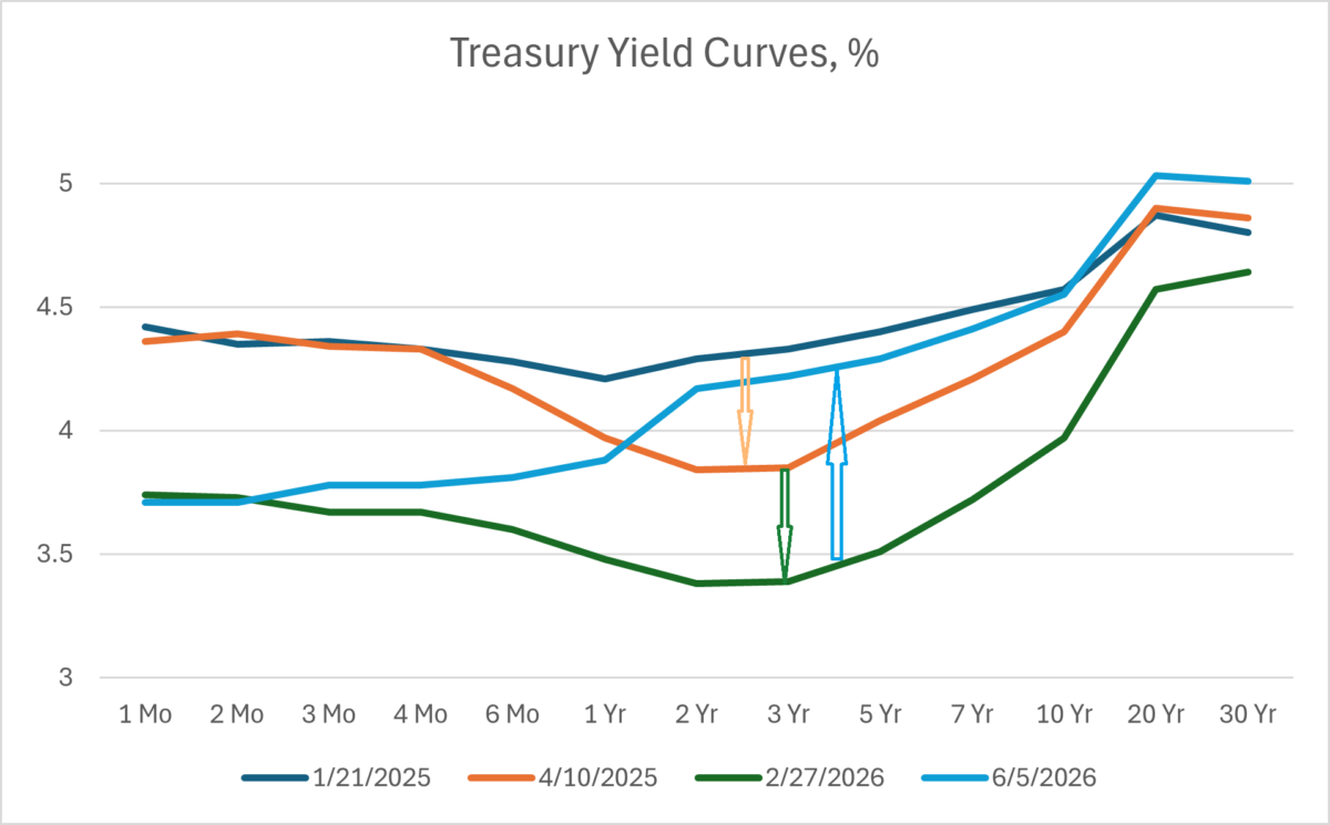
Figure 2: Yield curve for US Treasurys as of 1/21/2025 (blue), as of 4/10/2025 (tan), as of 2/27/2026 (green), and as of 6/5/2026 (sky blue), all in %. Source: Treasury.
The rise in the long yield could also be attributable to default risk, but this remains pretty small, as far CDS’s are concerned.
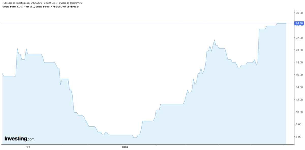
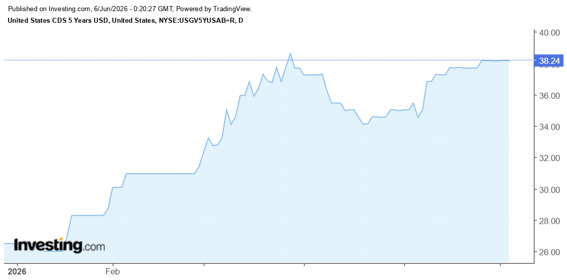
The 5 yr CDS rate implies a 0.64% default probability assuming a 40% recovery rate.
Source link