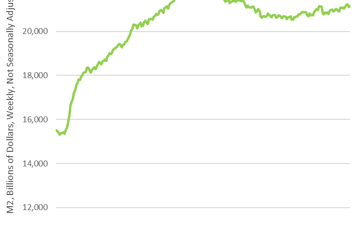
Item 1:
Source: Antoni.
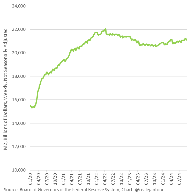
Item 2:
Source: Antoni.
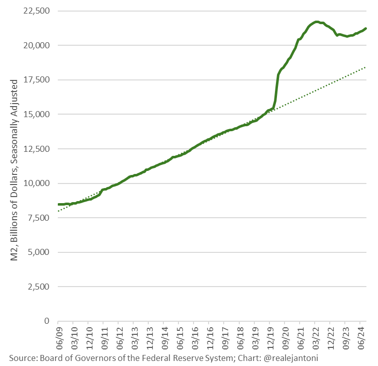
Not that the data are “wrong” (I’m not a data conspiracy theorist). Just without context, it’s pretty meaningless. Here’s what a relevant graph might show (motivated by the Quantity Theory):
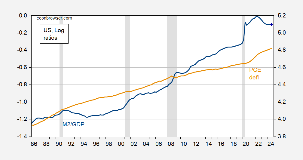
Figure 1: M2 to GDP (blue, left scale), M2 to GDPNow (10/18) (blue +, left scale), PCE deflator (tan, right scale), all in logs. NBER defined peak-to-trough recession dates shaded gray. Source: Federal Reserve, BEA via FRED, Atlanta Fed, NBER, and author’s calculations.
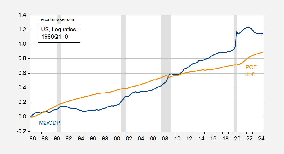
Figure 2: M2 to GDP (blue, left scale), M2 to GDPNow (10/18) (blue +, left scale), PCE deflator (tan, right scale), all in logs, 1986Q1=0. NBER defined peak-to-trough recession dates shaded gray. Source: Federal Reserve, BEA via FRED, Atlanta Fed, NBER, and author’s calculations.
By the way, try a cointegration test on these series, for some illumination.
Source link