And 30 years of turnover data. Currently doing regressions on data on reserve bank holdings, in a project with Jeffrey Frankel and Hiro It. In terms of aggregates, we have 50 years of estimates (about 25 years of actual data, and yet fewer years on (selected) individual central bank data)
First, what we know of reserves as disclosed by IMF members:
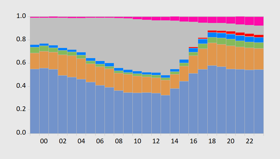
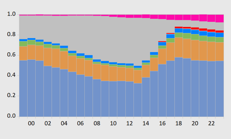
Figure 1: End-of-Year holdings of foreign exchange reserves in USD (blue bars), EUR (orange), JPY (green), GBP (blue), CNY (red), others (pink), unallocated (gray), all shares of 1.0, stacked. 2023 observation is for 2023Q3. Source: IMF COFER, accessed 1/7/2024, and author’s calculations.
Looking at Figure 1 without further investigation would impel one to think the USD had recovered its luster after years of neglect. However, if one notes the gray area is “unallocated”, or undisclosed, and further if one thinks a large portion of this was in USD, then the decline looks less marked. Whatever decline in the USD has occurred, much is accounted for by “other”, and the biggest change in “other” is from the Australian and Canadian dollars.
Through 2004 or so, the IMF provided in its annual reports estimates of reserve holdings shares. I use the reported numbers for 2000-01 to infer the proportions of unallocated reserves that are in each currency, to generate estimated shares (the proportions are 0.5 for USD, 0.07 for EUR, 0.09 for GBP, 0.07 for JPY, and 0.01 for CHF. This yields the following graph.
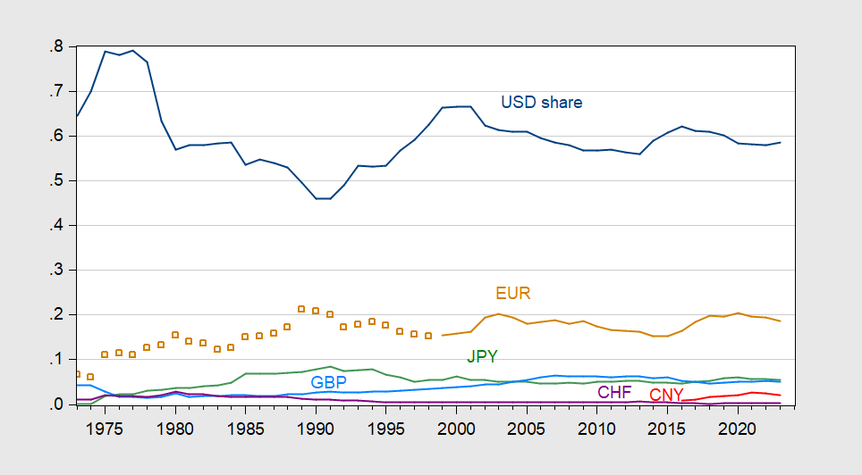
Figure 2: Share of foreign exchange reserves held by central banks, in USD (blue), EUR (orange), EUR legacy currencies (tan squares), JPY (green), GBP (sky blue), Swiss francs (purple), CNY (red). For 1999 data onward, estimates based on COFER data, and apportionment of unallocated reserves, described in text. Source: Chinn and Frankel (2007), IMF COFER accessed 1/7/2024, and author’s estimates.
Note with the estimated USD share, the US has retained its dominance, with only a slight decline in share of total forex reserves. The biggest dip is just before 2015.
A not dissimilar story is told by fx turnover.

Figure 3: Share of foreign exchange turnover in all forex instruments, in USD (blue, left scale), EUR (orange), JPY (green), GBP (sky blue), Swiss francs (purple), CNY (red). Linear interpolation between survey years. Source: BIS, and author’s calculations.
Source link